Ditto
Ditto keeps data in sync when the network can't be trusted, running in places that can't go down: quick-service kitchens, airline operations, the factory floor. The technology is mission-critical and a little invisible, and the brand had outgrown it. Our job was to make Ditto look as serious as the systems it runs inside, without making it cold.
The challenge
Two different rooms, one brand. Ditto sells to QSR enterprise buyers who expect modern and ahead of the curve, and to the Department of Defense and government contractors who need to trust it on sight. The same brand had to win a fast-moving tech buyer and hold up in a briefing to a military general. Modern enough for the first room, sure-footed enough for the second.
My role
I owned the client relationship and the strategy: the vertical analysis, the positioning and the foundations both audiences had to share. Ditto sells to QSR enterprise and to government contractors, so my job was to keep the brand, the decks and the product work speaking to both, and to make sure no design choice for one room alienated the other. I aligned the client on the direction, then the design team built it.
How I approached it
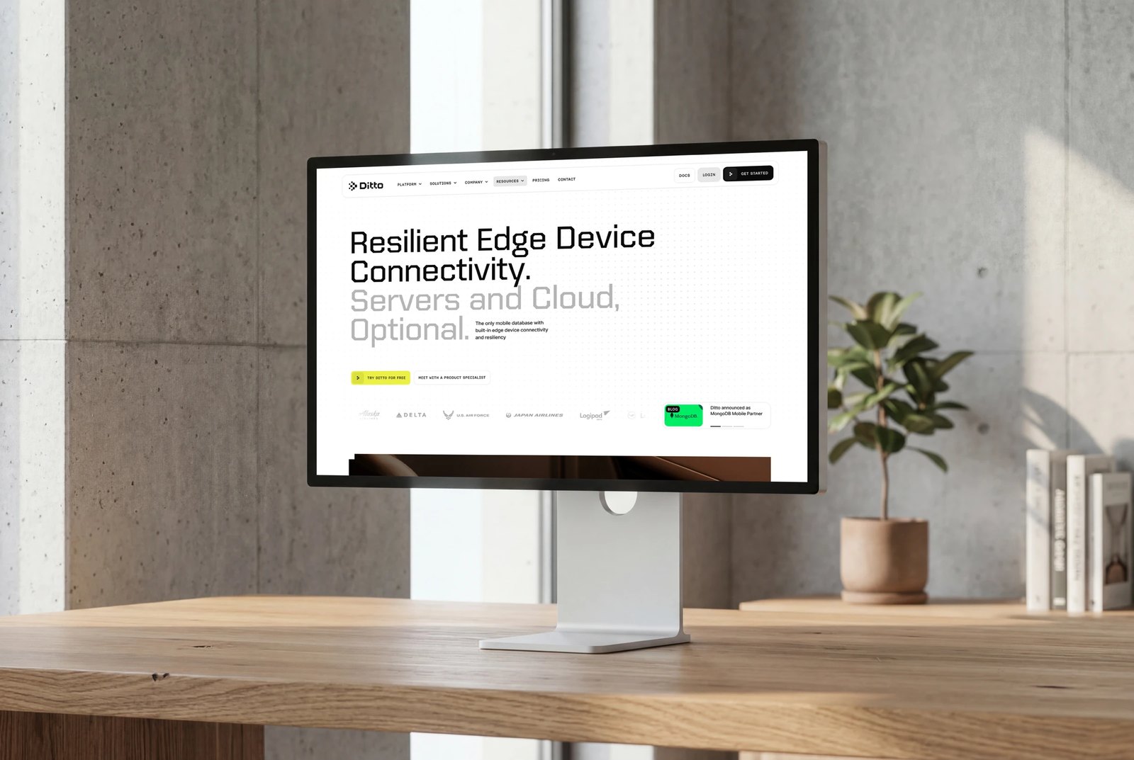
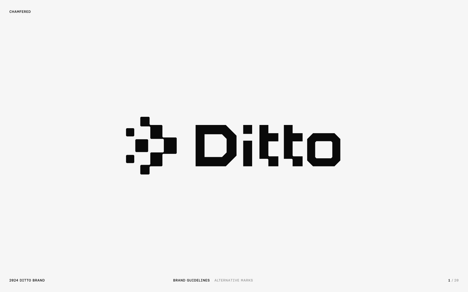
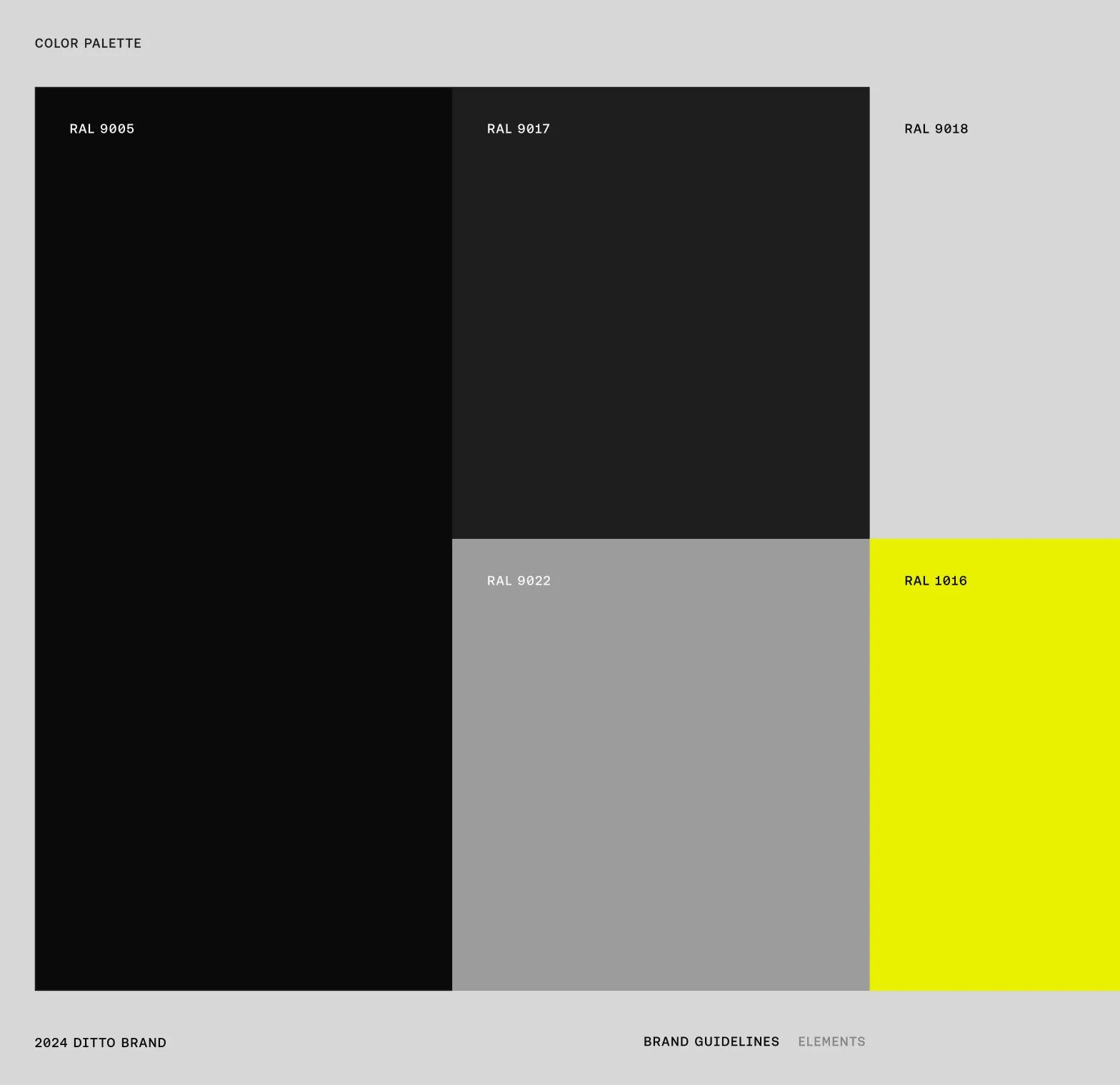
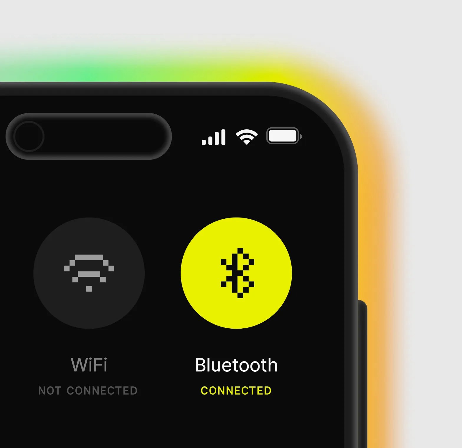
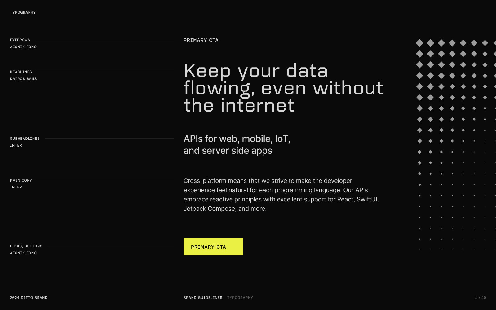
Approachable and serious are not opposites. The identity comes straight from the product: Ditto moves data in small pieces, so the brand does too. A chamfered logotype, a pixel mark that reads like packets finding their way home, black and white with one signal yellow that means one thing only. Synced.
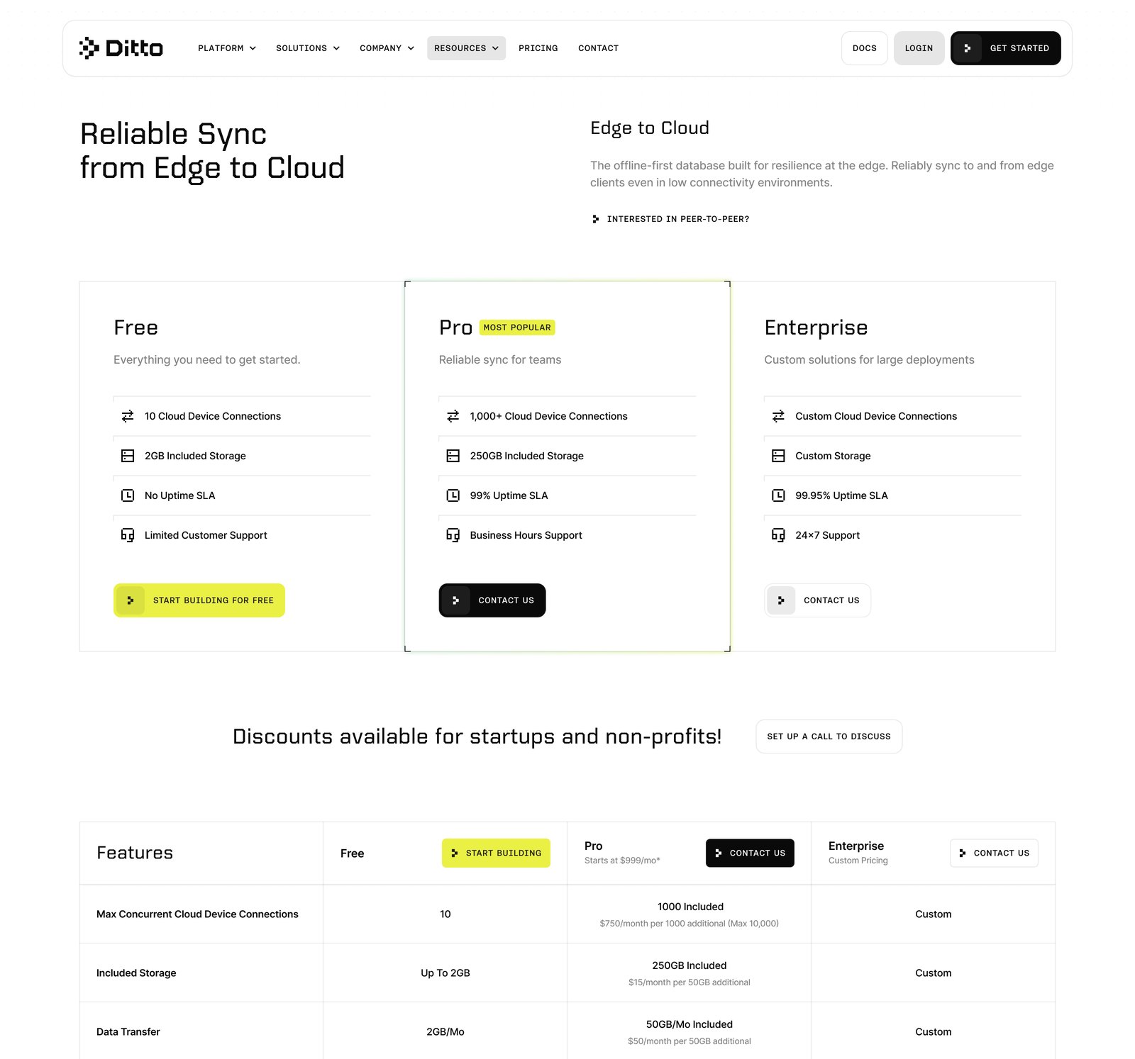
So the voice got more human and the proof got harder at once. We pulled third-party validation forward, rewrote the calls to action around what a buyer wants next and made the positioning blunt: resilient edge device connectivity, servers and cloud optional. We used AI to read both markets fast, and built the system to be AI-ready so an agent can generate assets for either audience without drifting off-brand.
A brand that only holds up on the marketing site is not a brand. It is a paint job.
The result
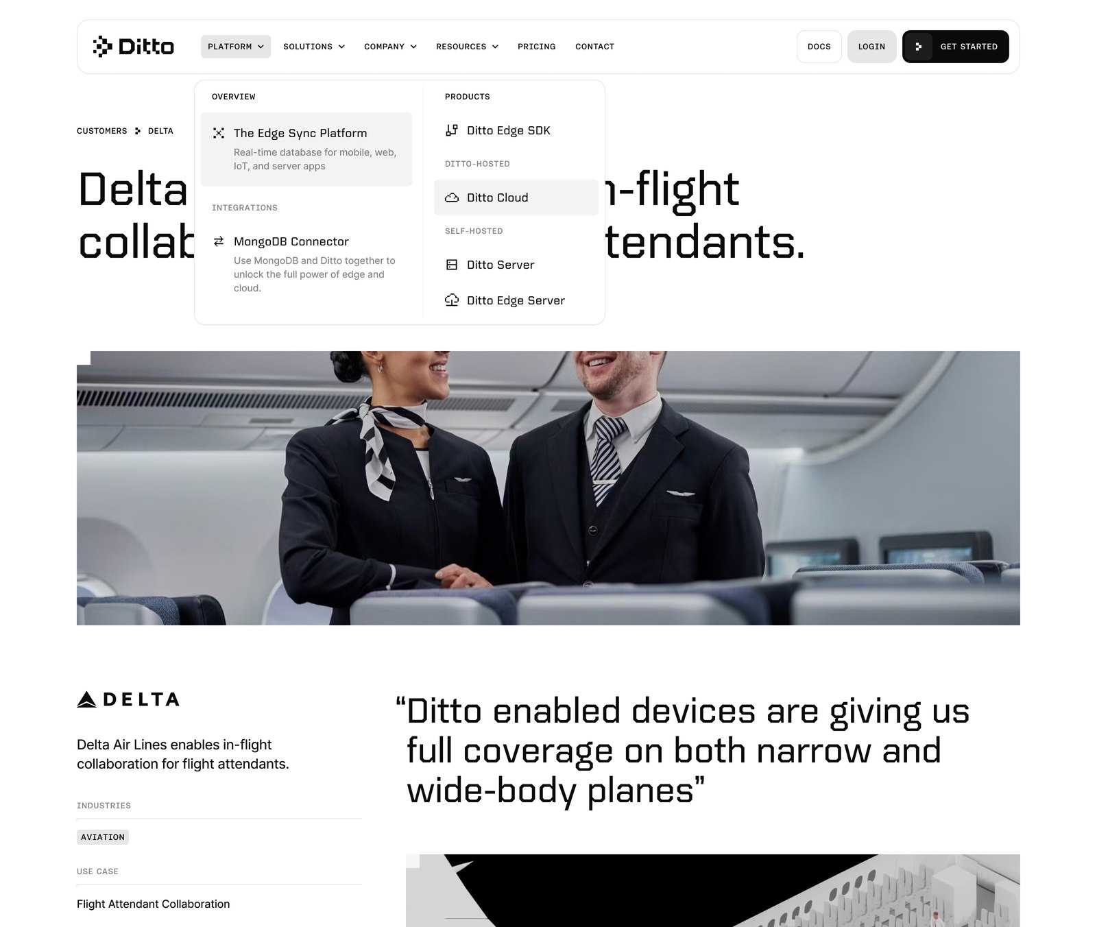
One brand that talks to product leaders and enterprise buyers without picking a side, running light and dark across the site, the decks and the collateral. Customer stories from Alaska Airlines, Delta and Japan Airlines carry the proof.