Flex
The goal
Flex came in with a brand that was, in their own words, fine. Not bad, not memorable. The audience is early-stage social impact founders, who can smell a generic finance brand a mile off. We had two weeks to make Flex worth trusting.
The challenge
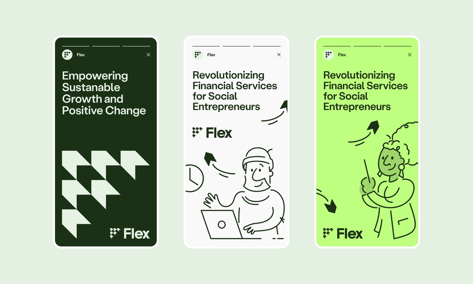
Fintech has a look: cold blues, stock photos of people pointing at laptops, a tone that says serious institution and nothing else. That builds distance, not trust. Flex needed the opposite, on a two-week clock. The rule: real people in the imagery, no stock and nothing AI-generated. And it had to be a design language, not a one-off, holding up across marketing, web and product, warm and credible at once.
My role
I did not push the pixels. I set the direction and owned it: the moodboard concepts, the themes to lean on and the quality bar across brand and marketing. My lane is client strategy, product strategy and the voice of the user. The design team executed, and I challenged the work against what we knew about the target customer until it served the user and the goal.
How I approached it
We started with a moodboard, not a logo. Tone, texture and direction first, because if the feeling is wrong, no amount of polish saves it.
The big call was photography: real people, not stock, because real faces earn the trust a finance brand is asking for. And we built it as a foundation, not a final answer. An early-stage company changes fast, so the brand had to be strong enough to hold and loose enough to grow. We moved fast with AI on the research and the market read, but held the line on imagery: real people, nothing AI-generated, because that is what earns trust.
Stock imagery is the fastest way to feel fake. And fake is fatal for a finance brand.
The result
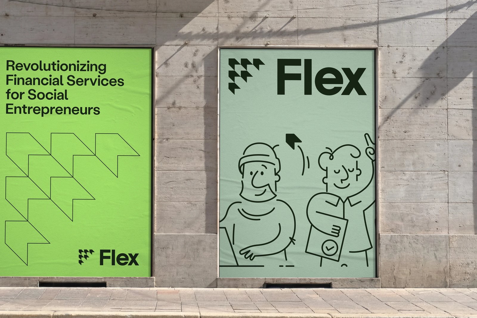
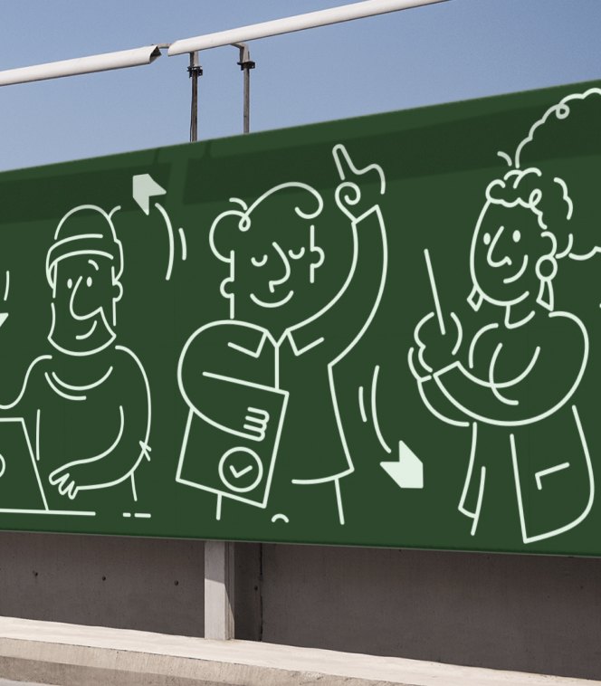
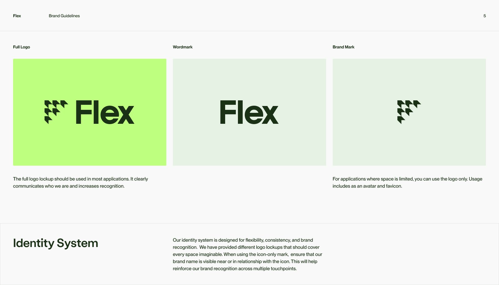
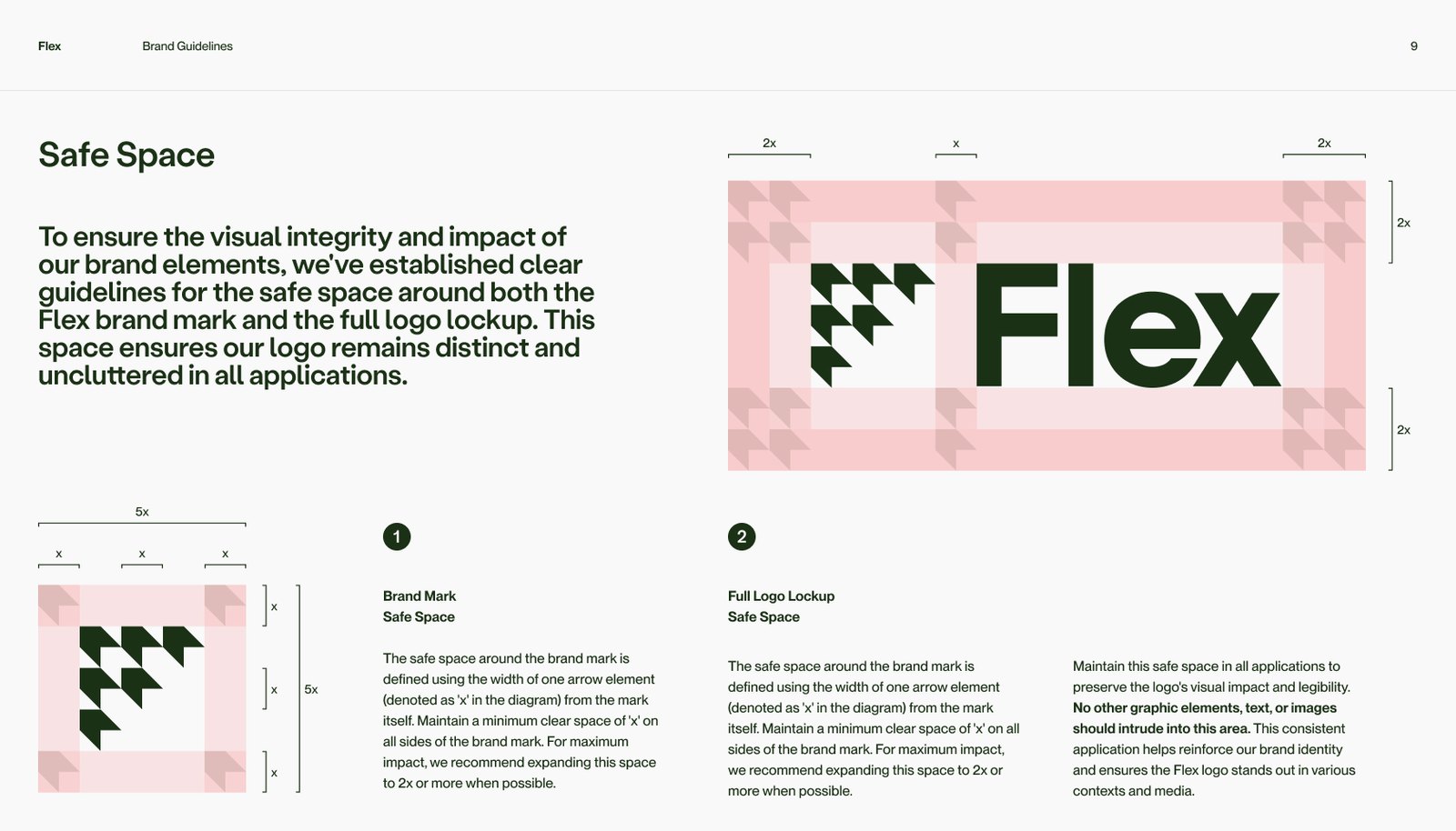
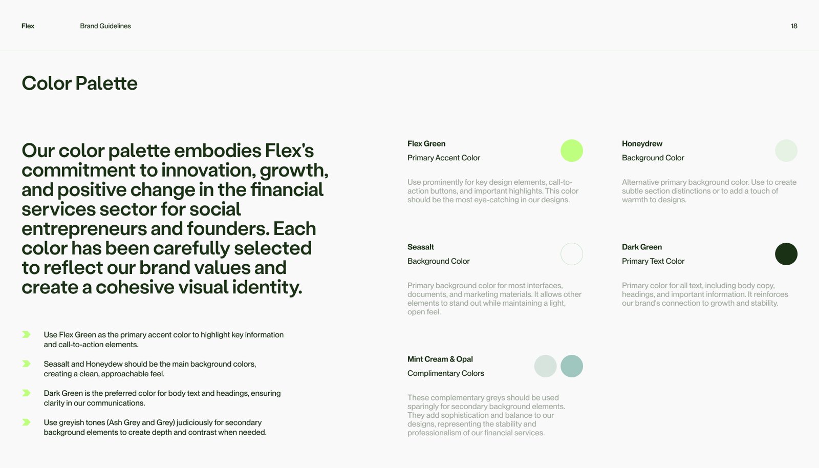
A fresh, human brand that does not look like every other fintech. Approachable enough for a founder, credible enough for the money. Built in two weeks, built to evolve.